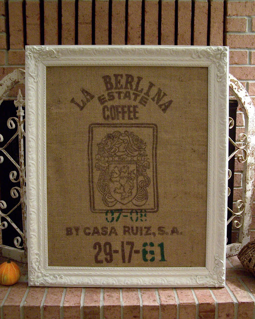
This is what I found at GW the other day for $5. It was a good size frame. About 33x24. Though the lovely painting did not go with anything around here. The frame I thought was worth the five dollars.
Look what was behind it when I started to take it apart. The corn ad was the paper that topped the cardboard dream whip. I sort of like the corn ad and thought it might be some fun pop art framed for the kitchen. It's a bit torn though. I'm not sure why dream whip wants to pay me .25.
I started off spray painting the frame but all I had was glossy and it was too shiny. So I brought it inside and used a brush and some creamy white paint. Then I tried some glaze but I wasn't thrilled with it so I just went back over most of it with the white. I may give it another go later but for now I like the white. I had this coffee sack with a pretty cool graphic on it. I wrapped it around the old cardboard print and duct taped it on the back. Then popped it back in. The sack is still in one piece if I want to use it later for something else.
I may hang it at the top of the staircase since it's a good size and I need something large there. Well not I, he. Hubby will be thrilled to get back on the ladder and do another balancing act for me I'm sure.
So what do you think about mixing the rough burlap with the more ornate white frame? Too weird? Come on be honest, I can take it.
Linking up with:
Cottage Instincts Make it 4 Monday
Cottage Instincts Make it 4 Monday
see you later,


Anita~ I love the mix!! The beautiful ornate white frame with the rustic burlap- love it. It works beautifully and is the unexpected. Anyone might have either of those things in a room... but together, beautiful! You raised the burlap up a few notches in that frame!! Thanks for sharing! :)
ReplyDeleteI think it's a cute combo! Great project, thank you so much for sharing!
ReplyDelete: )
Julie M.
Oh I LOVE this! Yup.. the juxtaposition between the rough and the pretty is so cool. Very eye catching. :)
ReplyDeleteDonna
http://funkyjunkinteriors.blogspot.com/
I love the burlap and the ornate frame together! I like things that are a little more unusual so I love this. It's a fun piece of artwork.
ReplyDeleteOh I love it! Burlap and white is my favorite neutral combo :) It looks cool leaning up against the fireplace too!
ReplyDeleteLove the burlap and the white together! And yes, darkness at 5pm is a total bummer!
ReplyDeleteOoh I love it!! Don't you just love GW!!!! I find so much fabulous stuff there:)
ReplyDeleteI love it, love the mix of textures, the fancy with the practical, and so on. It's a winner in my book!
ReplyDeleteI love the graphic. Great sac. I think it's fine the ornate with the burlap.
ReplyDeleteHey, I also like the fireplace screen in the background!
I love burlap any ol' way. I think it looks great... it'll look even better hanging up somewhere.
ReplyDeleteI hear ya about the light situation. On Friday I literally SPED home after work to try and get some pictures but it was already too dark. Grrrr for winter!!!!
Love it. Its a keeper. Looks awesome. The frame is terrific and so is the burlap. Combined together - it looks great!!
ReplyDeleteLove it! Perfect balance. If you decide the frame is too pristine, you can always distress it a little with sandpaper, etc.
ReplyDeleteBrenda
I like it a whole lot.
ReplyDeleteHappy early Thanksgiving!
I would never have thought to put those two together and it looks great.
ReplyDeleteanita, that looks so pretty! i love it! mandie said she emailed you both ebooks (bonus!) so let me know if you don't get it.
ReplyDeleteI love this! Love the burlap against the bright white.
ReplyDeleteAnita, I love it! It looks great!
ReplyDeleteI love it! Rustic and refined...a good combo :)
ReplyDeleteIt's perfect! Gotta love simple projects like this, and the extra ad art? Bonus!
ReplyDeleteWHITE LOVE!
ReplyDeleteWhat a cool coffee sack! I love the graphic on it!
ReplyDeleteThis is so great! I want to make one, too!
ReplyDeletewww.uvinyl.com
www.uvinyl.blogspot.com
Love this idea. I love the coffee sack with the white fancy frame. They look great together.
ReplyDeleteLooks very pretty and love the brown/white--just feels cozy!
ReplyDeleteHow can I NOT love this?!? What I'd love even more is an entire wall filled with them! :) Awesome.
ReplyDeleteDonna
Love it...now I want one too! ~Deb~
ReplyDelete